
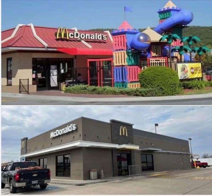
If you haven’t walked into a McDonald’s in a while, the first thing you’ll probably notice isn’t the menu. It’s the décor.
Gone are the bright red roofs, colorful booths, tile floors, playful murals, and giant PlayPlaces. In their place are gray walls, faux wood finishes, black furniture, pendant lighting, and touchscreen kiosks. Many newer locations could easily be mistaken for a coffee shop, an airport café, or a generic fast-casual restaurant.
It’s a dramatic change, and it wasn’t accidental. Over the past two decades, McDonald’s has deliberately redesigned nearly every aspect of its restaurants.
It Wanted to Appeal to Adults, Not Just Kids
For much of the 1980s and 1990s, McDonald’s openly positioned itself as a family restaurant. Ronald McDonald, Grimace, Happy Meals, birthday parties, and PlayPlaces made children the center of the experience.
Over time, however, the company began focusing more heavily on adults. Adults buy breakfast on the way to work, stop for coffee during their commute, and grab dinner after a long day. Those customers often visit more frequently than families making an occasional weekend trip.
As a result, McDonald’s shifted its image from a fun place for kids to a convenient place for everyone.
The colorful interiors that delighted children did not necessarily appeal to someone looking for a quick coffee or a quiet place to eat lunch. The newer designs were intended to feel more mature, modern, and comfortable for adults.
McCafé Changed the Look
One of the biggest reasons for the redesign was the growth of McCafé.
As McDonald’s began competing more directly with Starbucks, Dunkin’, and other coffee chains, it became clear that the restaurants themselves needed to look more polished. Bright plastic furniture and cartoon characters did not fit the image of a café serving espresso drinks.
The company gradually adopted darker colors, wood textures, softer lighting, and more contemporary furniture. The goal was to create an atmosphere that felt less like a playground and more like a modern coffee shop.
PlayPlaces Became Less Important
Indoor playgrounds were once one of McDonald’s biggest attractions, but they gradually became harder to justify.
They were expensive to build and maintain, required constant cleaning, occupied valuable floor space, and came with safety and liability concerns. At the same time, fewer families were spending long periods inside fast-food restaurants as drive-thrus, takeout, and delivery became more popular.
For many franchise owners, the space could be used more efficiently for additional seating, self-service kiosks, delivery pickup areas, or a larger kitchen.
Fast Food Became More About Speed
Modern McDonald’s restaurants are designed around customers who often are not planning to stay.
Mobile ordering, curbside pickup, delivery services, and self-order kiosks have changed how people use the restaurant. Instead of encouraging customers to linger, today’s layouts focus on processing orders as quickly and efficiently as possible.
The dining room is no longer the center of the business. Much of the operation now revolves around the drive-thru, app orders, and delivery pickups.
Minimalist Design Is Easier to Maintain
The newer look also makes practical business sense.
Neutral colors and simple materials are easier to standardize across thousands of locations. They are often easier to clean, replace, and renovate than highly customized interiors filled with colorful fixtures and themed decorations.
The result is a restaurant that is simpler to operate, but also far less visually distinctive.
McDonald’s Followed a Larger Design Trend
McDonald’s is not the only company that moved toward neutral colors, wood accents, industrial lighting, and minimalist interiors. Many fast-food chains, retail stores, coffee shops, and hotels adopted similar designs during the same period.
These spaces are often meant to communicate cleanliness, efficiency, and modernity. The problem is that when every company follows the same design language, they all begin to look alike.
The Trade-Off
McDonald’s modernized because its business changed. The company wanted to appeal to adults, compete in the coffee market, reduce maintenance costs, and redesign restaurants around drive-thru, mobile, and delivery orders.
Those decisions help explain why the restaurants look cleaner and more polished than they once did. They also explain why they now feel so sterile.
Older McDonald’s locations had a personality. You could recognize one instantly from the street, and stepping inside felt different from visiting any other fast-food chain. They were bright, loud, colorful, and clearly designed to make children excited about being there.
Today’s restaurants are more restrained and more efficient, but they are also more generic. Remove the Golden Arches, and many could easily be mistaken for another coffee shop, airport restaurant, or fast-casual chain.
McDonald’s did not become sterile by accident. It happened because the company stopped designing its restaurants as destinations and started designing them as systems for moving customers through as quickly as possible.