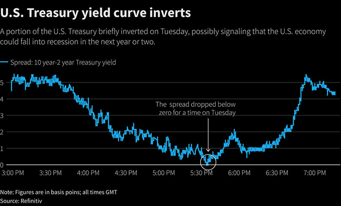
The yield curve shows how interest rates on bonds change for different time periods. Bonds are basically loans that investors make to the government or companies. The investor gets paid an interest rate on the bond.
Usually, a longer-term bond has a higher interest rate than a shorter-term bond. For example, a 30-year bond typically pays more interest than a 10-year bond, because the investor has to wait longer to get their money back. This makes the yield curve sloped upward like a hill – short-term bonds have lower rates at the bottom, and long-term bonds have higher rates at the top.
Sometimes though, short-term rates become higher than long-term rates, and the yield curve slopes downward instead. This is called an “inverted yield curve.” It’s unusual, and some investors see it as a potential warning about the economy in the future.
The key thing to understand is that the yield curve shows how interest rates are different for short-term versus long-term lending. Watching the shape of the curve can give investors important clues about economic conditions.
Need an easier to understand expalnation?
Imagine you’re at a candy store. You know those candies that you love so much, right? Okay, let’s say the store owner offers you a deal.
You can buy a candy now for $1, or you can pay him $1 now and he’ll give you a candy one year from now. And here’s the catch, if you decide to wait a year, he’ll give you an extra little treat as a thank you for waiting. That little treat is similar to what we call ‘interest’ in finance. It’s like a reward you get for waiting.
Now, let’s think about the different waiting periods. If you decide to wait for 1 year, you might get a small treat. If you decide to wait 2 years, you may get a bigger treat. And if you decide to wait 10 years, you’d expect a much bigger treat, right? Because you’re waiting for a longer time!
This idea of getting a bigger treat the longer you wait is similar to what we call a ‘yield curve’ in finance. A yield curve is a graph that shows how much reward (or ‘yield’) you can get for different amounts of waiting time (we call these ‘maturities’). Most of the time, this graph or ‘curve’ goes up, which means you get a bigger treat the longer you wait.
But sometimes, things get weird and the curve can go down. That would be like if the store owner said he’d give you a smaller treat if you waited 10 years instead of 1 year. It doesn’t make much sense, right? Why would you wait longer for a smaller treat? Well, in finance, when that happens, it often means that people think the economy might not be doing so well in the future.
In the end, the yield curve is just a tool that helps us understand what rewards people expect to get for waiting different amounts of time to get their money back.
